Tidewater
Monitoring for marine energy installations.
- Client
- Tidewater Energy
- Sector
- Industrial monitoring and energy
- Year
- 2023
- What we did
- UX research, interface design
- Built with
- React, TypeScript, WebGL charting, a design system
The brief
Tidewater operate marine energy installations and monitor them from shore. Their engineers watch telemetry from equipment sitting in salt water, in weather, a long way from anyone who could go and look at it.
The existing monitoring tool showed everything at once, all the time, with no sense of what mattered. Engineers had learned to ignore it, which meant that when it did have something urgent to say, nobody was listening.
We were brought in to redesign the telemetry dashboard and the alerting around it. The real brief, once we understood the operation, was to make the tool worth paying attention to.
The challenge
Alarm fatigue is the defining problem of industrial monitoring. When a system cries wolf often enough, the humans correctly learn to discount it, and the software's whole purpose evaporates.
Tidewater's tool had this badly. Thresholds had been set conservatively at installation and never revisited, so a substantial share of alerts were noise. The engineers had built personal filters, mental and literal, and the ones that mattered were getting caught in them.
There was a second, subtler problem. Marine telemetry is noisy by nature. Waves, weather and tides all move the numbers, and a reading that would be alarming in a factory is completely normal offshore. The interface had no way to express normal variation, so every fluctuation looked like an event.
And there was a physical constraint. Engineers often check the system on a phone, outdoors, in daylight, sometimes on a boat. Designing for a comfortable desk would have missed the moment when the tool matters most.
What we did
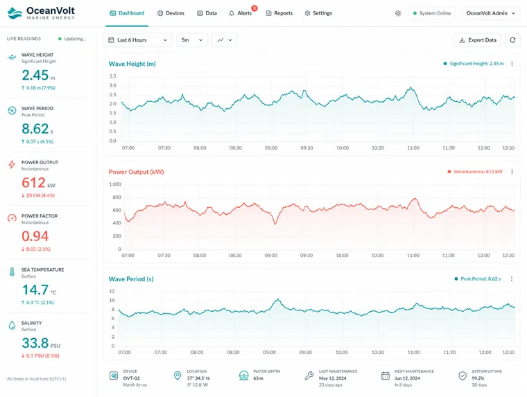
We changed what the dashboard is for. It stopped trying to show the state of everything and started showing deviation from expected.
Each chart now carries a band of normal variation behind the live line, derived from that installation's own recent history rather than a threshold set once at commissioning. A reading inside the band is visibly unremarkable. A reading outside it is visibly not. Engineers can see the difference at a glance without knowing the numbers.
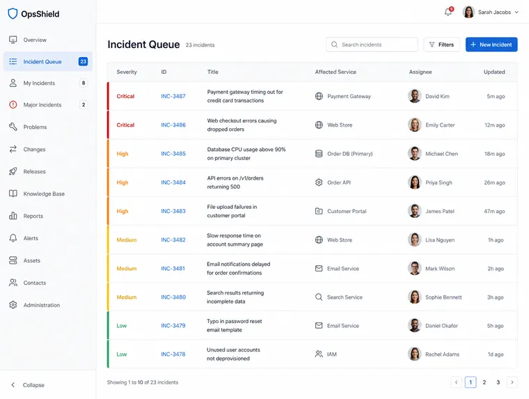
Alerts were rebuilt as a queue ordered by consequence, with the severity bar at the leading edge of each row so it survives a fast scan. Related alerts collapse into one incident, because one failing sensor generating forty notifications is not forty problems.
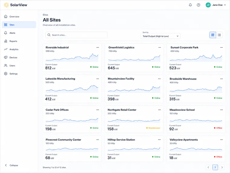
The site overview became a grid of cards, each with a sparkline, so an engineer can take in the whole estate in one screen and drill into the one that looks wrong.
We designed the phone case first rather than last. Large targets, high contrast that survives sunlight, and the incident queue as the default view, because someone reaching for their phone is almost never browsing.
The outcome
The engineers started using the tool as their first check rather than their last resort. Collapsing related alerts into incidents removed most of the noise that had trained them to ignore it in the first place.
The band of normal variation turned out to be the change that carried the most weight. Expressing what normal looks like, rather than only flagging what is abnormal, gave the interface a way to be reassuring as well as alarming, and a monitoring tool that can say nothing is wrong is a tool people will actually open.
The design system now covers Tidewater's shore side tooling generally, and their team has extended it to two further internal products.