Palisade
Access and identity console for security teams.
- Client
- Palisade
- Sector
- Security and identity software
- Year
- 2024
- What we did
- Product design, front end
- Built with
- React, TypeScript, a policy editor built from scratch
The brief
Palisade sell an access and identity console to security teams. The product had grown by accretion: every customer request had become a setting, and every setting had become a checkbox, until the policy screen had over two hundred controls with no structure between them.
Customers were not complaining that it was ugly. They were complaining that they were afraid of it. Several had stopped changing policies altogether, which is the worst possible outcome for a security product, because a policy nobody dares edit is a policy that stops matching reality.
The brief was to make the policy editor something a security engineer could use confidently at four in the afternoon on a Friday.
The challenge
Fear in an interface is a design signal, and it comes from a specific place: the user cannot predict what will happen when they act.
In Palisade's case the fear was well founded. Policies interacted in ways the interface did not show. Changing one rule could silently widen access somewhere else entirely, and there was no way to find out except by saving and watching the audit log.
The hard constraint was that we could not simplify the underlying model. Access control genuinely is a system of interacting rules, and flattening it would have made the product less capable in exactly the situations customers bought it for.
So the work was not reduction. It was making consequence visible before commitment. The user needed to see what a change would do while they were still deciding whether to make it.
What we did
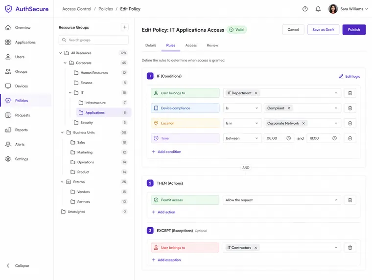
We built the policy editor around a preview rather than a form. As a rule is edited, the interface shows what it would grant and to whom, updating as you type, before anything is saved.
That single change did most of the work. A control whose effect you can see stops being frightening, and the two hundred settings stopped needing to be memorised because the interface answers the question they were all really asking.
We restructured the settings themselves around resources rather than features, because that is how security engineers think about their estate. The left hand tree became the mental model: this is the thing being protected, and these are the rules that apply to it.
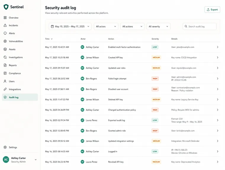
The audit log was redesigned as a narrative rather than a table. Each entry reads as a sentence with an actor, an action and a target, because when something has gone wrong nobody wants to parse columns. Severity is carried by a bar at the row's edge, which survives being scanned quickly.
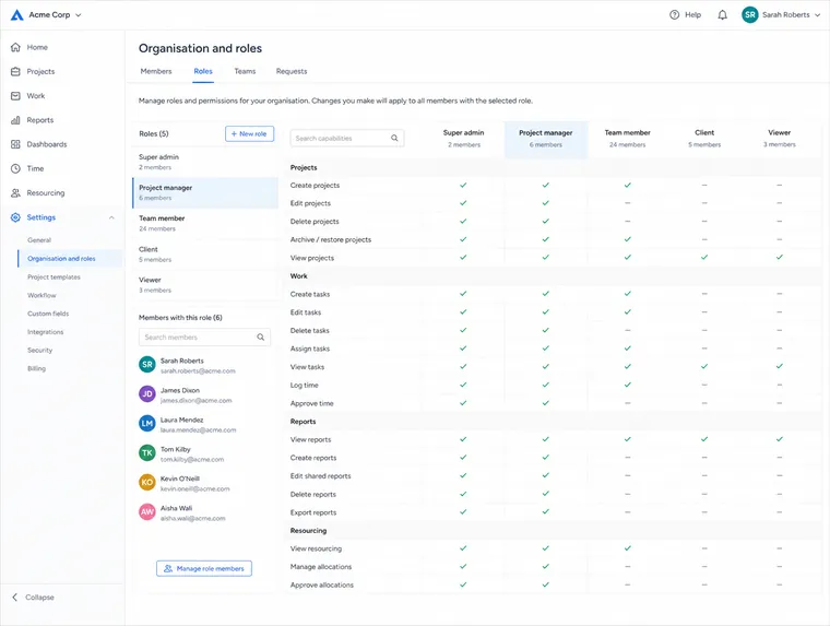
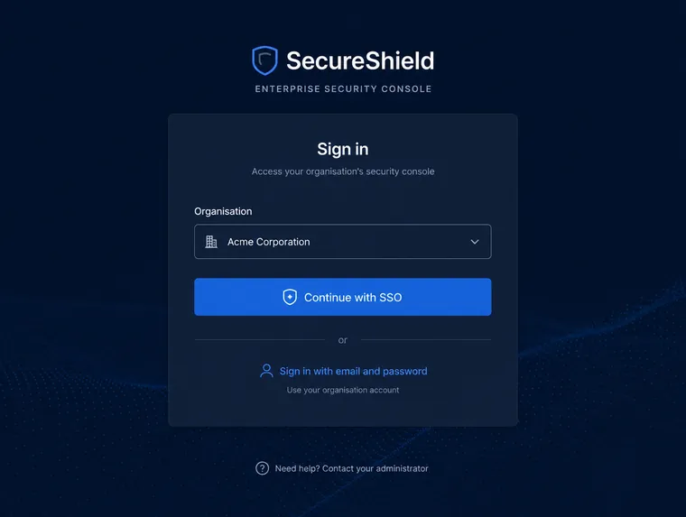
Single sign on and the organisation and roles views were rebuilt in the same language, so that the product stopped feeling like several tools that happened to share a login.
The outcome
Customers started editing policies again. That was the whole goal and it is the only measure we cared about, because a security product whose users are too nervous to configure it is failing quietly regardless of what its feature list says.
The preview pattern has since spread through the rest of the product. Once a team has seen that showing consequence beats explaining it, they tend not to go back to writing help text.
The most useful thing we left behind was not a screen. It was the principle that in security software, the interface's job is to make the outcome of an action visible before the action is taken.