Ledgerline
Treasury and reconciliation for finance teams.
- Client
- Ledgerline
- Sector
- Financial software and treasury
- Year
- 2025
- What we did
- UX, interface design
- Built with
- React, TypeScript, a component library, a bespoke data grid

The brief
Ledgerline build treasury and reconciliation software for mid sized finance teams. The product worked and the company was growing, but the sales team kept losing deals at the demo, and always at the same moment: the reconciliation screen.
They came to us for a visual refresh. We asked to watch three demos before agreeing to anything. In all three, the prospect went quiet at the same point, and in all three the salesperson started explaining the interface rather than the value.
That is a design problem wearing a marketing costume. The brief became: make the reconciliation screen explain itself, so that the person demonstrating it can talk about outcomes instead of mechanics.
The challenge
Reconciliation is genuinely complicated. Two sets of records have to be matched, the ones that do not match have to be investigated, and the reasons have to be auditable afterwards. There is no version of this that is simple, and any design that pretends otherwise is lying to the user in a way they will discover at the worst possible moment.
So the challenge was not simplification. It was legibility under density. The screen has to show a great deal at once and still let someone find the single row that is wrong.
Finance interfaces also carry a specific burden: the person using them is accountable for what they approve. That changes what good design means. Speed matters less than certainty. A control that is fast but ambiguous is worse than one that is slower and unmistakable, because the cost of a confident mistake is enormous.
There was also a technical constraint that shaped the design. The grid needed to handle tens of thousands of rows without the browser struggling, which ruled out several patterns that would otherwise have been obvious.
What we did
We rebuilt the reconciliation screen around a single idea: matched and unmatched are not two filters on one list, they are two different jobs.
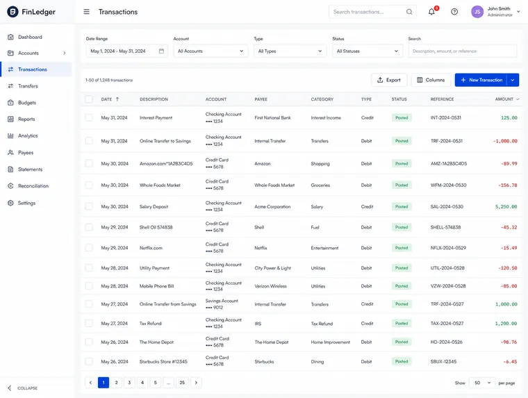
Matched items became a quiet, scannable record you confirm in bulk. Unmatched items became a working queue where each row opens into the evidence behind it, with the two records side by side and the difference between them called out rather than left to be spotted.
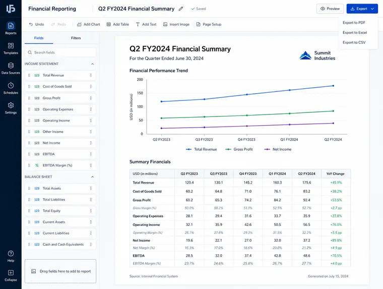
Numbers are set in a monospaced face and right aligned, so columns of figures line up on the decimal and the eye can compare down a column instead of reading across. That sounds like a small thing. In a screen made almost entirely of numbers it is most of the design.
We were disciplined about colour. Status is carried by shape, label and position first, with colour as reinforcement rather than the only signal. Finance teams work long hours on poor monitors, and a substantial minority of any user base cannot rely on a red and green distinction at all.
For the demo problem specifically, we designed the empty and first run states properly. A prospect seeing the product for the first time is, by definition, looking at an interface with no data in it. That state had never been designed. It is now the one that does the selling.

The outcome
The reconciliation screen stopped being the moment the demo went quiet. The salespeople began opening with it rather than working up to it, which is the outcome we were actually hired for even though nobody phrased it that way.
Inside the product, the change that mattered most was the audit trail becoming visible in the interface rather than reachable through it. When a finance lead can see who confirmed what and when, without leaving the screen they are working in, the software stops being something they use and starts being something they can defend.
The data grid we built has since become the foundation for the rest of the product's tabular screens, which is why we build systems rather than pages.